Studio 77
Logo | Branding
Pete approached Logo Paul, to implement a
re-brand of his media production company.
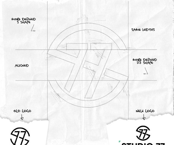
After our initial meeting and after breaking Studio 77's brand down, I suggested we looked at a logo evolution instead of revolution. No need to re-brand for re-branding sake. Pete had the foundations for an amazing brand and with some tweaks plus a little evolution of the brand, Pete's brand would look slick and professional.
Pete was a brilliant client and was fully on board with everything that I had suggested. A modern logo has various different applications both on and off line - so the logo needs to reflect this and be flexible to use. The new Studio 77 brand is flexible in its approach but still maintains the essence of the brand. The colour palette adds a little punch and vibrancy to the bold black colour of the brand identity that will help Studio 77 stand out long into the future.
Photography rights: Studio 77

It was an absolute pleasure working with Pete a real honour to work on his brand.
Not every project requires a complete start again approach. His original Studio 77 brand had the potential to be a great brand. I developed the brand to a new level and Pete now has a mark that will be bold that will stand the test of time for years to come.
Web: Studio 77


